Statista lets you tailor how each statistic is displayed, so you get the most relevant—and visually clear—information for your needs.
Using the gear button
Click the gear button on any statistic. Here, you can:
Select your chart type: Switch between a bar chart, line chart, or view the data in a table format—whatever best suits your analysis or presentation.
Configure data labels: Make your charts more readable by customizing or removing data labels. If a chart looks crowded, simply click any label to hide it. This helps clarify your statistic before you download it. To get more control, choose the Custom option.
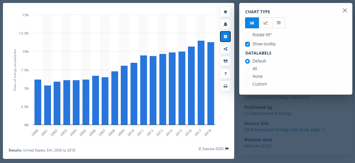
Settings for a statistic
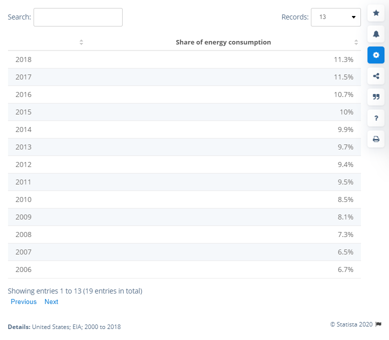
Here’s what a table looks like in Statista:
Example of a statistic in table format
Here is an example of a line chart:
Example of a statistic in line chart format
TIP:Adjust your visualization settings before downloading for the best possible presentation—ensuring your reports, slides, and analyses are accurate and visually effective.